AREA: a closer look into the process of our very first project

Introduction:
Hello! Our name’s are Maya and Gavneet, AKA Mayneet. We joined the Qoom Creator group for the spring cohort, in April of 2021. We both had an interest in coding, but were coming into this cohort with limited experience. Previously we learnt the basics of languages like Python and Java, however, the world of web development was new to us.
Since this was more of a learning opportunity for us, we decided we wanted to learn and create basic things like a clock, a weather widget, a to do list, etc. We decided to take these everyday widgets and create a whole dashboard with them.
Our Inspiration:
We were inspired by Apple’s iOS 14 software update where widgets such as a weather display, a reminder widget and a function that allowed the user to upload an image were created. For our clock, we wanted to create something like Apple’s Mac clock display, known as a fliqlo clock.
The Process We Took To Build Our Webpage:
Planning:
We spent the first week and a half planning out our idea. We made a simple diagram of our vision and decided that this (image below) would be our goal by the end of our 12 weeks. Though this may not look like a daunting project to take on, it definitely was for us.
Building Our Webpage:
About halfway through our project, we had made all of our widgets and began to focus on displaying them all on the same page. During these weeks we encountered a lot of errors, and spent countless hours on facetime troubleshooting them together.
During the last few weeks, we added a homepage along with a login/ sign-up feature, courtesy of a very detailed and helpful QOOM tutorial! We then had to link all of these pages together.
Last but not least, we worked a lot on the styling of our website, added colour features and made everything look more put together. In our opinion, giving the user the option to choose the font colour and background colour of our dashboard made all the difference in our webpage, as it made it much more pleasing to the eye.
The Final Product:
Though we did not stray too far from our original plan that we made the first week, we still surpassed our initial expectations for how it would turn out!
Building Our Widgets:
This was our first ever web project. We were intimidated and felt overwhelmed with our idea, since we had so many widgets we wanted to add to our single webpage. So we decided to create new HTML, CSS and JS files for each widget we made.
We decided to start with the easier widgets like the personable welcome message and the date and added the more complex widgets, such as the upload image button, at the end.
Shout outs to Stack Overflow and w3schools and other websites for helping us with the coding process for each of our widgets (seriously, you can find anything online!). By the 5th week, we had created all our widgets. We were very excited and thought things were only going to get easier from here, but they didn’t. We still needed to be able to display each of the widgets on one page, and our single project had too many HTML, CSS and JS files. We didn’t know how this was going to work out.
Modules:
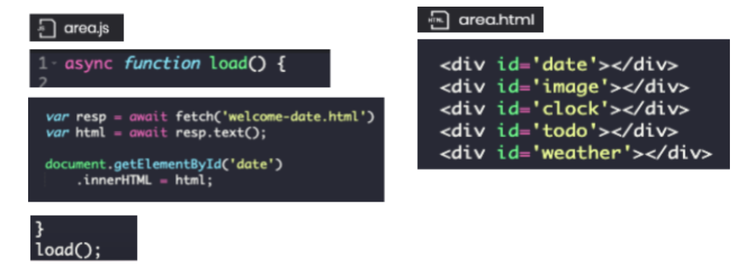
We were hit with our first major challenge. Displaying all the different widgets on one page. This is where we first learned about the asynchronous function. With the async function, we were allowed to first fetch all the HTML (which included the CSS) for each widget, and then we were able to load those HTML files for every feature on one JS file.
In the area.JS file we gave each widget an ID, and then displayed each of the widgets through calling those ID’s on our area.HTML file.

Global Variables:
Global variables were super helpful with our project, since we had multiple files and we needed to be able to have variables be reachable from any file within the project.
Local and Session Storage:
We learned how to store variables so that upon refreshing or exiting and reentering the webpage, the user’s inputted information (their name, to-do list tasks, and uploaded image) would remain on the screen.
Local storage is more permanent than session storage, and we used either one depending on what was fitting for each specific widget.
Final Thoughts:
As we go forward in our coding journey, we are definitely planning to utilize the QOOM software more. The user friendliness of QOOM made our experience 10x better and gave us lots of opportunities to learn!
Check it out here: https://plushcanal42.qoom.space/~/areajune28 !